![]() You don't know the power of the dark side!
Once upon a time, Android cloaked itself in shadow and cerulean. Triumphant cries of #YOLOHOLO rang out throughout the net as users reveled in a mobile experience that didn't blind them like the sun every time they checked their phone in bed. But then a shift came. Material Design ushered in a new age of bright, white Android apps, and one by one, even Google's own apps were drained of their contrast and their charcoal. The manufacturers followed in Google's footprints and system theme after system theme was dragged into the light.
Today, dark themes on Android are an exception, an increasingly uncommon feature sought out by users almost as fervently as it is avoided by nearly all major services and manufacturers. Android Pie dashed the hopes of a system-wide dark theme for another year, and none of Google's most prominent apps have dark themes available for their Android apps.
This is unfortunate for users, but even more so for the developers that shun the darkness, for there are a holy trinity of benefits to these devilishly dark designs.
Hexes and helpers
Dark themes can help your device last longer — with a catch
You don't know the power of the dark side!
Once upon a time, Android cloaked itself in shadow and cerulean. Triumphant cries of #YOLOHOLO rang out throughout the net as users reveled in a mobile experience that didn't blind them like the sun every time they checked their phone in bed. But then a shift came. Material Design ushered in a new age of bright, white Android apps, and one by one, even Google's own apps were drained of their contrast and their charcoal. The manufacturers followed in Google's footprints and system theme after system theme was dragged into the light.
Today, dark themes on Android are an exception, an increasingly uncommon feature sought out by users almost as fervently as it is avoided by nearly all major services and manufacturers. Android Pie dashed the hopes of a system-wide dark theme for another year, and none of Google's most prominent apps have dark themes available for their Android apps.
This is unfortunate for users, but even more so for the developers that shun the darkness, for there are a holy trinity of benefits to these devilishly dark designs.
Hexes and helpers
Dark themes can help your device last longer — with a catch
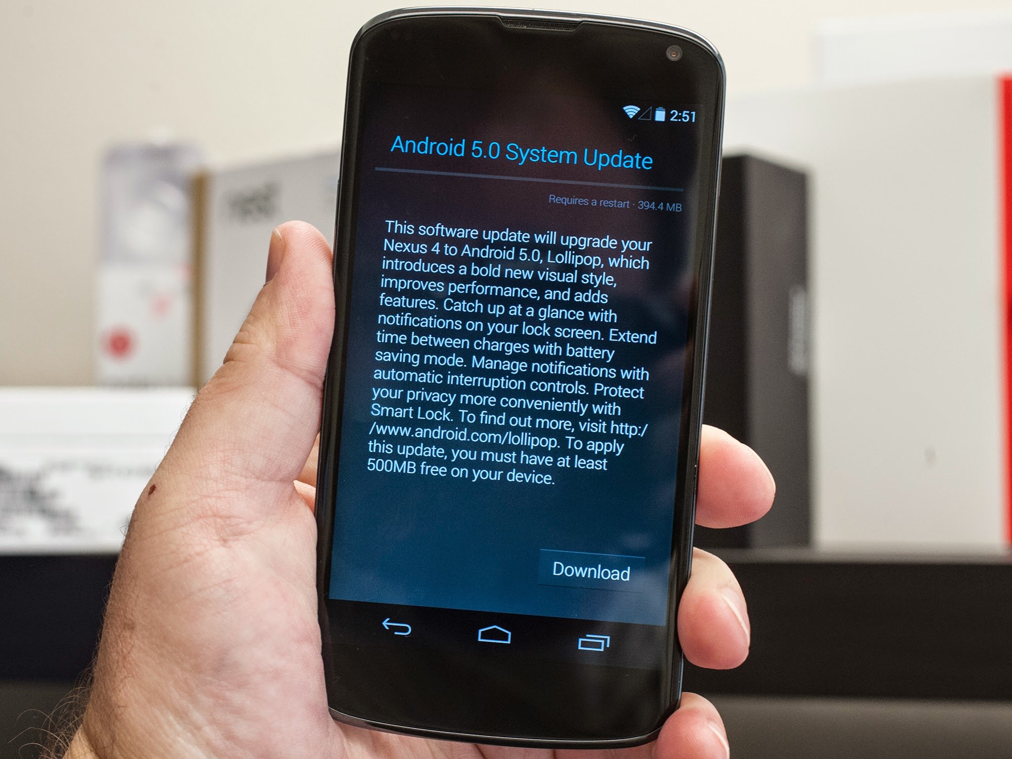
![]() Legends of dark themes whisper of miraculous power-saving, of letting a phone's screen sip battery like a fine whiskey for days instead of mere hours. It is indeed possible for a dark theme to be a boon to your battery when two conditions are met:
The phone uses an AMOLED display, where black pixels remain powered off and unilluminated
The app uses true, hex black — #000000 — for the majority of the dark theme
Legends of dark themes whisper of miraculous power-saving, of letting a phone's screen sip battery like a fine whiskey for days instead of mere hours. It is indeed possible for a dark theme to be a boon to your battery when two conditions are met:
The phone uses an AMOLED display, where black pixels remain powered off and unilluminated
The app uses true, hex black — #000000 — for the majority of the dark theme
 If your phone uses an LCD or IPS display, it doesn't matter if the theme uses hex black: your phone's entire screen is illuminated and drawing power. If an app developer uses anything above #000000 — the HOLO days of Android used charcoal gradients — then every pixel is turned on and drawing power on an AMOLED screen. For a dark theme to be even possibly battery saving, the majority of the theme needs to be true black with the rest of the theme using high contrast colors for text, buttons, and accents.
Dark themes are better for AMOLED displays — as long as they're using true hex black.
This powered-down perk does come with a drawback of its own. When an app uses hex black aka AMOLED black, scrolling text and swift movements can look jittery as individual pixels on your phone turn on and off. This is part of why dark themes on apps like Twitter use a dark color rather than true black, so every pixel stays on and the app doesn't look stuttery or slow when scrolling through your feed.
If your phone uses an LCD or IPS display, it doesn't matter if the theme uses hex black: your phone's entire screen is illuminated and drawing power. If an app developer uses anything above #000000 — the HOLO days of Android used charcoal gradients — then every pixel is turned on and drawing power on an AMOLED screen. For a dark theme to be even possibly battery saving, the majority of the theme needs to be true black with the rest of the theme using high contrast colors for text, buttons, and accents.
Dark themes are better for AMOLED displays — as long as they're using true hex black.
This powered-down perk does come with a drawback of its own. When an app uses hex black aka AMOLED black, scrolling text and swift movements can look jittery as individual pixels on your phone turn on and off. This is part of why dark themes on apps like Twitter use a dark color rather than true black, so every pixel stays on and the app doesn't look stuttery or slow when scrolling through your feed.
 The problem with using a dark color instead of true black in a dark theme is that it lowers the contrast, and high contrast is more than a want for dark themes: it's an Accessibility need.
See in the dark
Dark themes aren't just good; they're good for you
High contrast modes are available for just about computing platform on the planet because for users with low vision, color-blindness, as well as for older users with eye strain — younger users with eye strain like me. High contrast is easier for those of us with bad eyes to read, and for everyone else, high contrast makes it easier to read/browse/work on a phone or computer for longer.
The problem with using a dark color instead of true black in a dark theme is that it lowers the contrast, and high contrast is more than a want for dark themes: it's an Accessibility need.
See in the dark
Dark themes aren't just good; they're good for you
High contrast modes are available for just about computing platform on the planet because for users with low vision, color-blindness, as well as for older users with eye strain — younger users with eye strain like me. High contrast is easier for those of us with bad eyes to read, and for everyone else, high contrast makes it easier to read/browse/work on a phone or computer for longer.
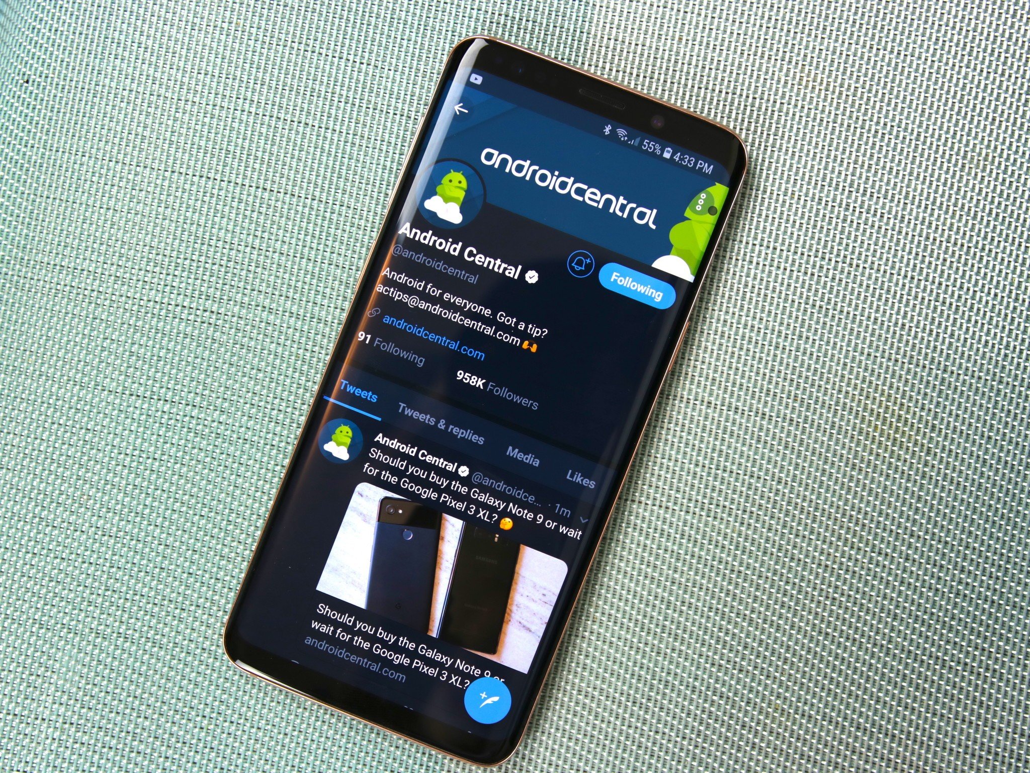
![]() Darkness comes with a price on Android right now: images are inverted, too.
Unfortunately, high-contrast mode on most platforms is just a color inverter. It doesn't change any hard-to-read fonts to something more legible, text isn't enlarged or spread out any better, and on Android and Chrome OS, all photos and videos are inverted, too, which makes for a trippy experience when browsing music apps or social media. These high contrast modes are also all-or-nothing, so services that naturally offer dark themes like YouTube Music are almost as blinding as an empty Google Doc.
By offering and encouraging more high contrast dark themes, Android could make itself easier on the eyes of heavy users and low-vision users, letting us keep using our favorite phones and favorite apps long into the night without our retinas yelling at us.
In the dark of the night
Dark themes let users browse and binge all night long
Darkness comes with a price on Android right now: images are inverted, too.
Unfortunately, high-contrast mode on most platforms is just a color inverter. It doesn't change any hard-to-read fonts to something more legible, text isn't enlarged or spread out any better, and on Android and Chrome OS, all photos and videos are inverted, too, which makes for a trippy experience when browsing music apps or social media. These high contrast modes are also all-or-nothing, so services that naturally offer dark themes like YouTube Music are almost as blinding as an empty Google Doc.
By offering and encouraging more high contrast dark themes, Android could make itself easier on the eyes of heavy users and low-vision users, letting us keep using our favorite phones and favorite apps long into the night without our retinas yelling at us.
In the dark of the night
Dark themes let users browse and binge all night long
![]() Because high-contrast themes with pure black backgrounds and properly spaced text are easier to read and use for longer periods of time, what a good dark theme means to a developer is more screen time, more engagement and likely more revenue.
The longer we can use an app, the more money its developer can make.
For apps that are ad-supported, the longer someone uses the app, the more ads they'll scroll through and the more money the developer will get. For apps that have in-app purchases or premium upgrades, the longer a user can spend in an app before their eyes need a break or the battery runs down, the more likely they are to go premium.
And the longer we can use our apps before our eyes beg for oblivion and our batteries beg for a charger, the longer and longer into the night we can use our Android phones for anything and everything.
Snuff out the light
Because high-contrast themes with pure black backgrounds and properly spaced text are easier to read and use for longer periods of time, what a good dark theme means to a developer is more screen time, more engagement and likely more revenue.
The longer we can use an app, the more money its developer can make.
For apps that are ad-supported, the longer someone uses the app, the more ads they'll scroll through and the more money the developer will get. For apps that have in-app purchases or premium upgrades, the longer a user can spend in an app before their eyes need a break or the battery runs down, the more likely they are to go premium.
And the longer we can use our apps before our eyes beg for oblivion and our batteries beg for a charger, the longer and longer into the night we can use our Android phones for anything and everything.
Snuff out the light
![]() Android Pie may not have brought the dark revolution that we were hoping for, but dark themes are continuing to creep back in from the shadows of Android. Android Pie included a toggle to let Quick Settings and system popups be dark, and YouTube should soon finally get its long-awaited dark theme, but there could be so much more.
Dark themes are better for our eyes, better for our batteries and better for developers' bottom lines. The time has finally come for Android and its developers to come back over to the dark side, so head to your favorite app, dive into the settings and find the "Send feedback" or "Contact developer" option.
Tell them to come to the dark side. We have cookies.
Android Pie may not have brought the dark revolution that we were hoping for, but dark themes are continuing to creep back in from the shadows of Android. Android Pie included a toggle to let Quick Settings and system popups be dark, and YouTube should soon finally get its long-awaited dark theme, but there could be so much more.
Dark themes are better for our eyes, better for our batteries and better for developers' bottom lines. The time has finally come for Android and its developers to come back over to the dark side, so head to your favorite app, dive into the settings and find the "Send feedback" or "Contact developer" option.
Tell them to come to the dark side. We have cookies.
source: https://www.androidcentral.com/dark-themes-norm-not-exception
date: Tue, 14 Aug 2018 16:00:03 +0000
Comments
Post a Comment