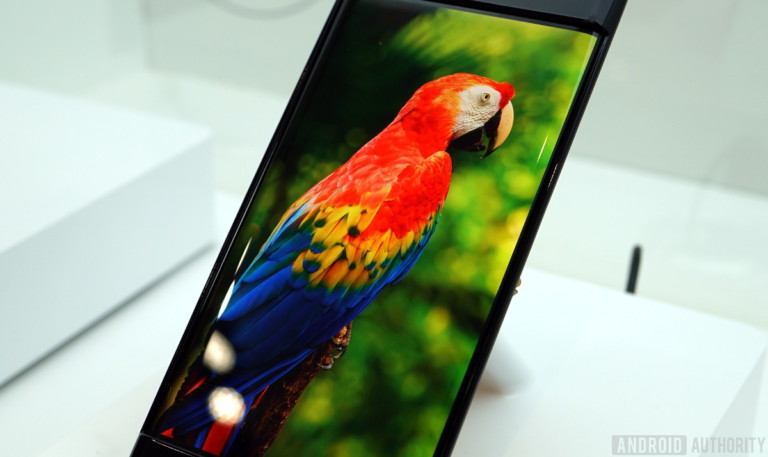
 Good color has come to the mobile market. Finally.
You might wonder just what I mean by that. After all, hasn’t there been a flood of phones and tablets with wide-gamut displays, brilliant bright colors, and incredible contrast specs? Sure. But as we just covered in the second part of this series, those bright colors coming from your wide-gamut display aren’t necessarily accurate colors. These displays can be pretty accurate, but until recently the rest of the system wasn’t up to the job. By “rest of the system,” I mean the OS.
With the introduction of the Oreo release of Android late last year, Google has given the mobile world color management, something that was never addressed in any previous version.
Good color has come to the mobile market. Finally.
You might wonder just what I mean by that. After all, hasn’t there been a flood of phones and tablets with wide-gamut displays, brilliant bright colors, and incredible contrast specs? Sure. But as we just covered in the second part of this series, those bright colors coming from your wide-gamut display aren’t necessarily accurate colors. These displays can be pretty accurate, but until recently the rest of the system wasn’t up to the job. By “rest of the system,” I mean the OS.
With the introduction of the Oreo release of Android late last year, Google has given the mobile world color management, something that was never addressed in any previous version.
 That all changed with the introduction of Android 8.0 Oreo. Google has given the mobile world color management, something previous versions never addressed. It’s the last major missing piece of the accurate-color puzzle. Color management features have become a standard part of PC operating systems and apps, but to date just haven’t been a big deal for mobile devices. Recently — as we’ve explored in this series — the growing trend of using these products for watching entertainment video and running other, more color-sensitive applications has meant that the ability to deliver good color is now much more important. Recent improvements in displays have given us the capacity for more accurate color, and Oreo’s color management means the entire system can now deliver on that promise.
In the old days, when “electronic display” meant “CRT,” the problem of creating colors with decent accuracy was actually a pretty easy one to address. Color CRTs all had very similar characteristics, and the standards for the only major source of color images (television) were just written around those. You were guaranteed good color (or at least as good as that technology could provide) simply because the whole system, from end to end, was built around a single known set of performance specs. The move away from CRTs changed all that. While the standards for the source imagery, whether television, digital photography, or computer-generated graphics were all still fairly similar and very CRT-centric, the range of available output devices grew large. Those same images might be seen on a CRT, various LCDs of different characteristics, plasma screens, and more, and the color wouldn’t be the same on any two of them!
The answer to that problem came in the form of color profiles, and the accompanying color management software. A color profile is, simply put, just a standardized description of how a given display or other output device makes color. It’s what takes values of R, G, and B, and outputs them as a color of X, Y, and Z. In an image, we can tell what assumptions were made when it was created, which might equate to “this image will be accurate when displayed on an sRGB-compliant device.” Given this information, and the profile of the display it’s to be shown on, it’s the job of the color management system to ensure the “best” (most accurate) colors result in the final displayed scene.
Here’s an example. Suppose we have a wide-gamut display, one with the primaries and resulting color gamut as shown in the bigger triangle in the diagram below.
That all changed with the introduction of Android 8.0 Oreo. Google has given the mobile world color management, something previous versions never addressed. It’s the last major missing piece of the accurate-color puzzle. Color management features have become a standard part of PC operating systems and apps, but to date just haven’t been a big deal for mobile devices. Recently — as we’ve explored in this series — the growing trend of using these products for watching entertainment video and running other, more color-sensitive applications has meant that the ability to deliver good color is now much more important. Recent improvements in displays have given us the capacity for more accurate color, and Oreo’s color management means the entire system can now deliver on that promise.
In the old days, when “electronic display” meant “CRT,” the problem of creating colors with decent accuracy was actually a pretty easy one to address. Color CRTs all had very similar characteristics, and the standards for the only major source of color images (television) were just written around those. You were guaranteed good color (or at least as good as that technology could provide) simply because the whole system, from end to end, was built around a single known set of performance specs. The move away from CRTs changed all that. While the standards for the source imagery, whether television, digital photography, or computer-generated graphics were all still fairly similar and very CRT-centric, the range of available output devices grew large. Those same images might be seen on a CRT, various LCDs of different characteristics, plasma screens, and more, and the color wouldn’t be the same on any two of them!
The answer to that problem came in the form of color profiles, and the accompanying color management software. A color profile is, simply put, just a standardized description of how a given display or other output device makes color. It’s what takes values of R, G, and B, and outputs them as a color of X, Y, and Z. In an image, we can tell what assumptions were made when it was created, which might equate to “this image will be accurate when displayed on an sRGB-compliant device.” Given this information, and the profile of the display it’s to be shown on, it’s the job of the color management system to ensure the “best” (most accurate) colors result in the final displayed scene.
Here’s an example. Suppose we have a wide-gamut display, one with the primaries and resulting color gamut as shown in the bigger triangle in the diagram below.
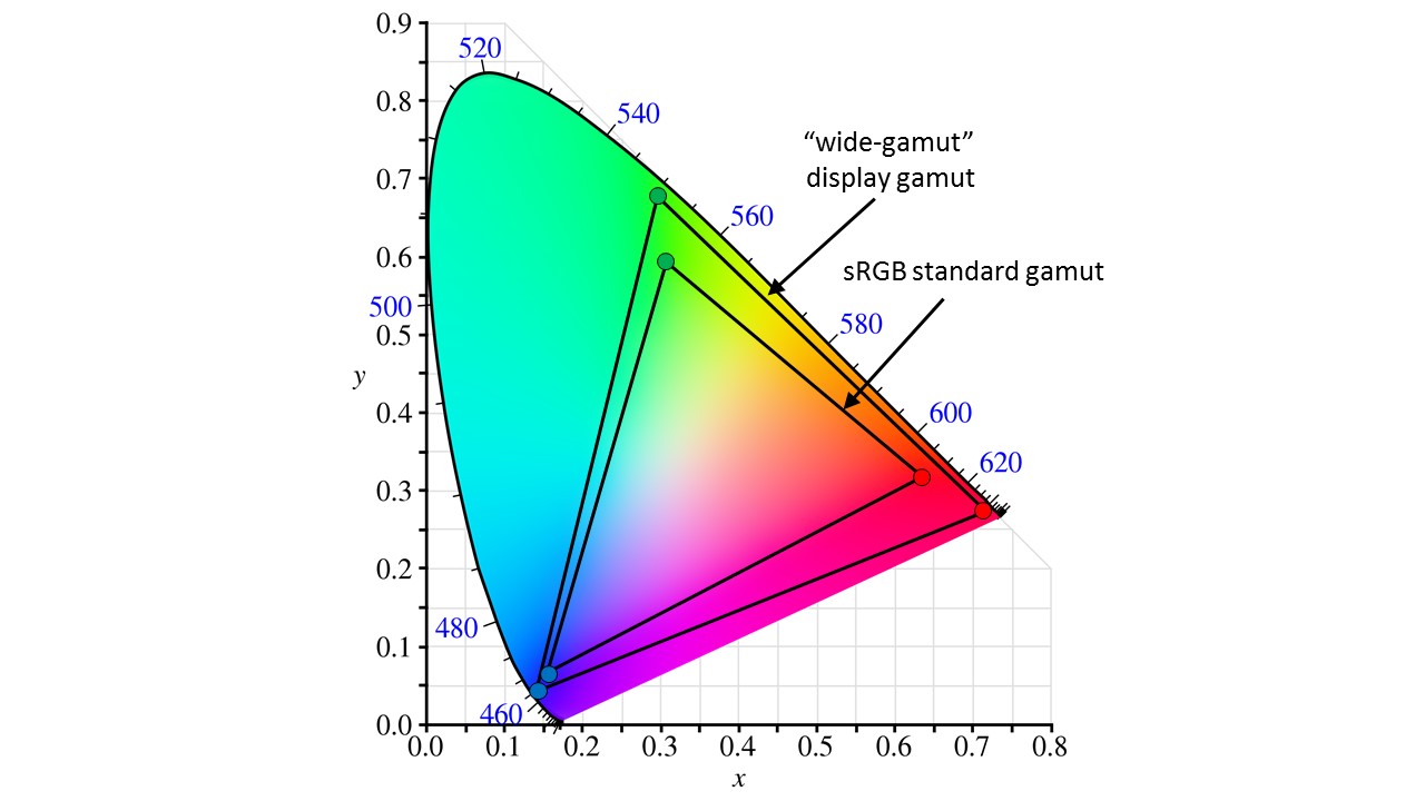 A “wide-gamut” display gamut (outer triangle) compared to the sRGB standard gamut.
This display obviously can show all of the colors in the sRGB space — which is the smaller triangle here — but that doesn’t necessarily make it a good sRGB display. In fact, if we try to show an image created under the sRGB spec on this display, and it has some pixels encoded as (255,0,0), which is just pure red at its maximum brightness, they’re obviously not going to be what the image creator intended. They’ll be at the color of the display’s red primary, not at the red specified in the sRGB standard.
A color management system (CMS) between the original image and the display can correct for this. Given that the CMS has both the display and image profile information, it “knows” the image was created expecting the sRGB color characteristics, and it also “knows” how the display differs from those. With that information, it can correct all of the RGB values in the image so they map to the correct colors (or as close as we can get to them) within the display’s range. The (255,0,0) pixels might be re-encoded as, say, (234, 25, 13), bringing in a little green and blue and “pulling” the red back to the sRGB spec. Other colors within the image would be similarly modified for the intended color and brightness results, too.
A “wide-gamut” display gamut (outer triangle) compared to the sRGB standard gamut.
This display obviously can show all of the colors in the sRGB space — which is the smaller triangle here — but that doesn’t necessarily make it a good sRGB display. In fact, if we try to show an image created under the sRGB spec on this display, and it has some pixels encoded as (255,0,0), which is just pure red at its maximum brightness, they’re obviously not going to be what the image creator intended. They’ll be at the color of the display’s red primary, not at the red specified in the sRGB standard.
A color management system (CMS) between the original image and the display can correct for this. Given that the CMS has both the display and image profile information, it “knows” the image was created expecting the sRGB color characteristics, and it also “knows” how the display differs from those. With that information, it can correct all of the RGB values in the image so they map to the correct colors (or as close as we can get to them) within the display’s range. The (255,0,0) pixels might be re-encoded as, say, (234, 25, 13), bringing in a little green and blue and “pulling” the red back to the sRGB spec. Other colors within the image would be similarly modified for the intended color and brightness results, too.
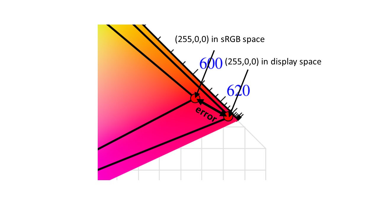 Displaying an image intended for one space on a display with a different gamut results in color error
This process has benefits even if the colors specified in the original image information lie outside the capabilities of the display. If the display’s native color gamut is smaller than sRGB, for instance, we can’t possibly create the colors at the extremes of that space. But a good CMS will still modify the image data so the resulting displayed image is at least closer to “looking right” than it would otherwise be. It might modify the hue, brightness, or other elements of a given color to present an overall result as close as possible to the original intent. More sophisticated systems might even rely on what we know of how the visual system responds.
This whole system clearly relies on actually having the profile data for both the expectations of the image source (what the intended output color space was originally) and the capabilities of the display (how it’s going to translate a given set of inputs into an output image). For the image, that’s usually pretty simple. Image creation, either by a particular device such as a camera or under the guidance of a human artist, generally starts out with an underlying assumption of a particular target color standard like sRGB, Rec. 709, or DCI. Even if the image doesn’t carry explicit profile information with it, it’s still fairly safe to assume a standard based on the source of any given image. Consumer digital photography is almost always done assuming the sRGB space.
But simply having color management available, even with all the profiles installed, doesn't mean that every color you see from now on will be perfectly accurate.
We see more variation with displays. However, in the case of mobile devices the choice of the display is generally up to the manufacturer of the device, and its relatively easy to imbed a profile for that display within the product. If not, that’s what “display calibration” is really all about. Rather than actually adjusting or “calibrating” the performance of the display, most cases of calibration are actually all about generating a profile that can describe that particular display to the CM system.
Displaying an image intended for one space on a display with a different gamut results in color error
This process has benefits even if the colors specified in the original image information lie outside the capabilities of the display. If the display’s native color gamut is smaller than sRGB, for instance, we can’t possibly create the colors at the extremes of that space. But a good CMS will still modify the image data so the resulting displayed image is at least closer to “looking right” than it would otherwise be. It might modify the hue, brightness, or other elements of a given color to present an overall result as close as possible to the original intent. More sophisticated systems might even rely on what we know of how the visual system responds.
This whole system clearly relies on actually having the profile data for both the expectations of the image source (what the intended output color space was originally) and the capabilities of the display (how it’s going to translate a given set of inputs into an output image). For the image, that’s usually pretty simple. Image creation, either by a particular device such as a camera or under the guidance of a human artist, generally starts out with an underlying assumption of a particular target color standard like sRGB, Rec. 709, or DCI. Even if the image doesn’t carry explicit profile information with it, it’s still fairly safe to assume a standard based on the source of any given image. Consumer digital photography is almost always done assuming the sRGB space.
But simply having color management available, even with all the profiles installed, doesn't mean that every color you see from now on will be perfectly accurate.
We see more variation with displays. However, in the case of mobile devices the choice of the display is generally up to the manufacturer of the device, and its relatively easy to imbed a profile for that display within the product. If not, that’s what “display calibration” is really all about. Rather than actually adjusting or “calibrating” the performance of the display, most cases of calibration are actually all about generating a profile that can describe that particular display to the CM system.
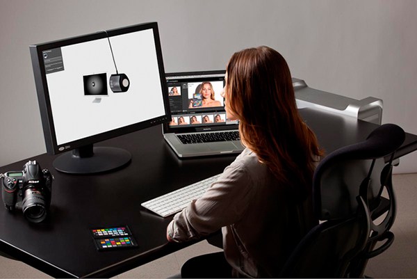 Colour Space Display calibration most often involves characterizing the display to produce a its color profile.
However, simply having color management available — even with all the profiles installed — doesn’t mean every color you see from now on will be perfectly accurate. There are varying degrees of color management sophistication, and in many cases multiple ways to deal with a given problem, depending in part on user preference. For instance, if colors specified by the image data lie outside the display’s gamut, we might choose to simply “clip” those colors to the nearest shade at the limits of the gamut. Or we might instead scale all of the color down so that the original space is entirely remapped to lie within the display’s capabilities. Either way, we give up some degree of accuracy (which in this case we couldn’t achieve for all colors anyway) for practicality, convenience, or simply getting the most pleasing image. There’s also the question of just how many resources we can devote to this task. The best possible color management techniques might require memory space or processing power beyond what we’re willing to commit. This is especially true on a mobile device, where both are in short supply. As is nearly always the case, compromises are necessary to deliver a workable solution.
What we’ve been given in Oreo isn’t a perfect solution — far from it, in fact. For one thing, the color management features aren’t always active across all apps.
We have to acknowledge that what we've been given in Oreo isn't a perfect solution.
The app developer can opt in (or out) of having Oreo’s CMS adjust the image data. Some pre-Oreo apps may even already be modifying their colors in anticipation of being run on wide-gamut, less accurate devices. Using color management requires app developers to have a better understanding of color, and of just how these systems work — there’s going to be a learning curve everyone will go through before color-accurate rendering becomes the norm.
What we’ve been given so far is really just the start. As display capabilities, mobile device processing power and memory, and color calibration options continue to develop, color management will continue to develop and to become more sophisticated in this space. With the introduction of color management in Oreo, Google has taken a huge step in the right direction.
That’s a good thing for everyone, no matter how you look at it.
Colour Space Display calibration most often involves characterizing the display to produce a its color profile.
However, simply having color management available — even with all the profiles installed — doesn’t mean every color you see from now on will be perfectly accurate. There are varying degrees of color management sophistication, and in many cases multiple ways to deal with a given problem, depending in part on user preference. For instance, if colors specified by the image data lie outside the display’s gamut, we might choose to simply “clip” those colors to the nearest shade at the limits of the gamut. Or we might instead scale all of the color down so that the original space is entirely remapped to lie within the display’s capabilities. Either way, we give up some degree of accuracy (which in this case we couldn’t achieve for all colors anyway) for practicality, convenience, or simply getting the most pleasing image. There’s also the question of just how many resources we can devote to this task. The best possible color management techniques might require memory space or processing power beyond what we’re willing to commit. This is especially true on a mobile device, where both are in short supply. As is nearly always the case, compromises are necessary to deliver a workable solution.
What we’ve been given in Oreo isn’t a perfect solution — far from it, in fact. For one thing, the color management features aren’t always active across all apps.
We have to acknowledge that what we've been given in Oreo isn't a perfect solution.
The app developer can opt in (or out) of having Oreo’s CMS adjust the image data. Some pre-Oreo apps may even already be modifying their colors in anticipation of being run on wide-gamut, less accurate devices. Using color management requires app developers to have a better understanding of color, and of just how these systems work — there’s going to be a learning curve everyone will go through before color-accurate rendering becomes the norm.
What we’ve been given so far is really just the start. As display capabilities, mobile device processing power and memory, and color calibration options continue to develop, color management will continue to develop and to become more sophisticated in this space. With the introduction of color management in Oreo, Google has taken a huge step in the right direction.
That’s a good thing for everyone, no matter how you look at it.
source: https://www.androidauthority.com/understanding-color-accuracy-smartphone-displays-885965/
date: Sat, 18 Aug 2018 21:00:22 +0000
Comments
Post a Comment